Why the Psychology of Color Matters in Your Home (Copy)
Remember when you walked into the guest room of your favorite relatives' home, glanced around at the calming blue on the walls, and instantly felt relaxed? Or even the purple undertones in the waiting room of the doctor’s office that made you feel as if you were in good hands. Well, that’s the power of color, my friends!
This blog post is all about the psychology of color and what it means for your home. Color psychology (using colors to influence your mood and behavior) is a new science, and there’s some evidence it helps reduce stress, improve sleep, and more.
Understanding the Usual Associations of Each Unique Color
Bright, warm colors (reds, oranges, yellows) stimulate energy and happiness while cool, subdued colors (blues, greens, purples) are soothing and calming.
Bright, warm colors are best in rooms for entertaining like dining rooms or kitchens, while cool colors work best in relaxing spaces like bedrooms or even bathrooms. Color psychology (using colors to influence your mood and behavior) is a new science, and there’s some evidence it helps reduce stress, improve sleep, and more.
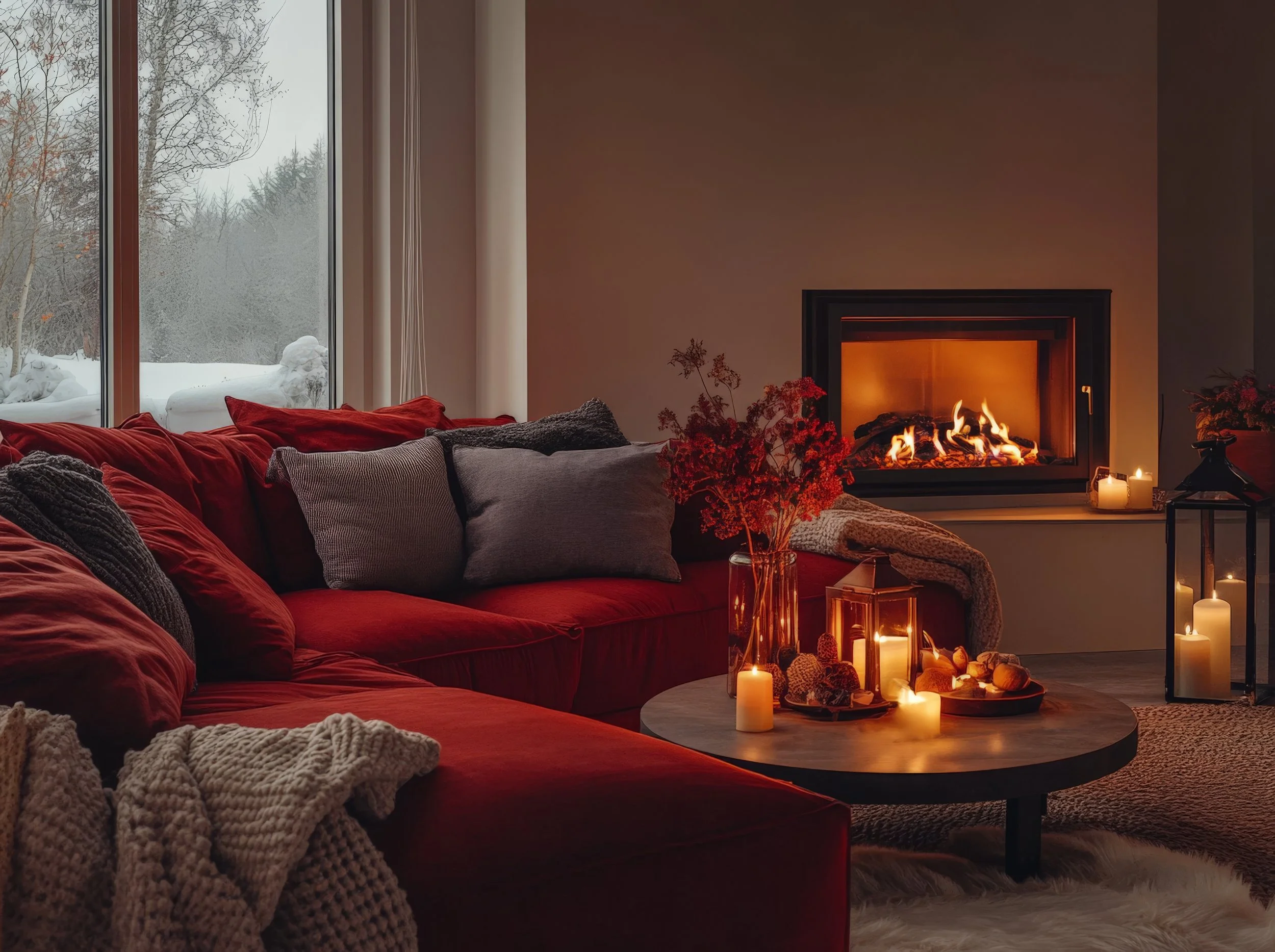
~Red is one of the most intense, stimulating colors that raises a room’s energy. In interior design, it can evoke a range of psychological responses. For example, red can stimulate appetite in dining areas and create a lively atmosphere. Red is associated with love, passion and anger. A little red goes a long way—just an accent wall or a few items of decor are enough to invigorate you. Red is best in dining rooms, living rooms, entryways, kitchens, and rooms for entertainment. Worst in: Bedrooms, rooms where you want to relax.
~Blue is associated with feelings of calm and relaxation. Blue has the opposite effect of red and is the most soothing color. Primary blue is used in therapeutic settings for meditation and relaxation because it helps you unwind, find peace, and become more comfortable expressing your inner feelings. It’s also associated with wisdom, creativity, and spirituality. Light blues are serene and can help with insomnia. Best in: Bedrooms, bathrooms, offices, spas. Worst in: Playrooms or gyms, kitchens, dining rooms, living rooms.
~Orange is another stimulating color that can trigger feelings like enthusiasm and passion. Best in: Exercise or playrooms, kitchens, living rooms, dining rooms.Worst in: Bedrooms, rooms where you want to relax
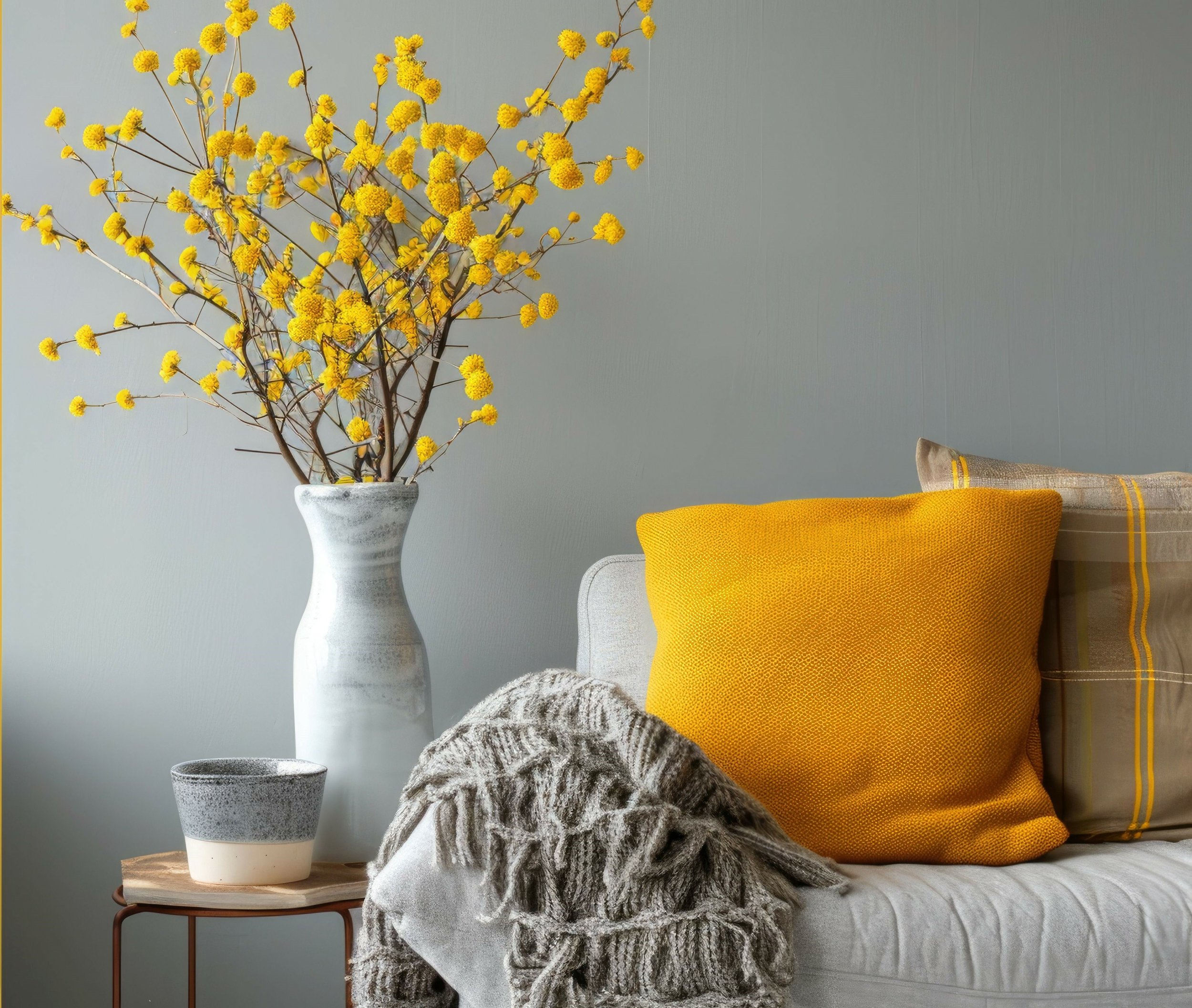
~Yellow is another intense, motivating color that triggers feelings of happiness. It's light and playful in small doses, but can be overwhelming or anxiety-inducing in large amounts (especially if you're already stressed) Best in: living rooms, bathrooms, kitchens, dining rooms. Worst in: bedrooms, nurseries.
~Pink is associated with kindness and love, and it’s believed to boost creativity and feelings of peace, calm, and hopefulness. Bright shades like fuchsia are linked to higher energy and confidence, while lighter shades give feelings of care and quiet strength. Pink is the calmest of the warm colors and has been used to soothe feelings of anger, resentment, or aggression (although too much can feel draining).Best in: Offices, bedrooms, nurseries Worst in: Living rooms, kitchens, dining rooms
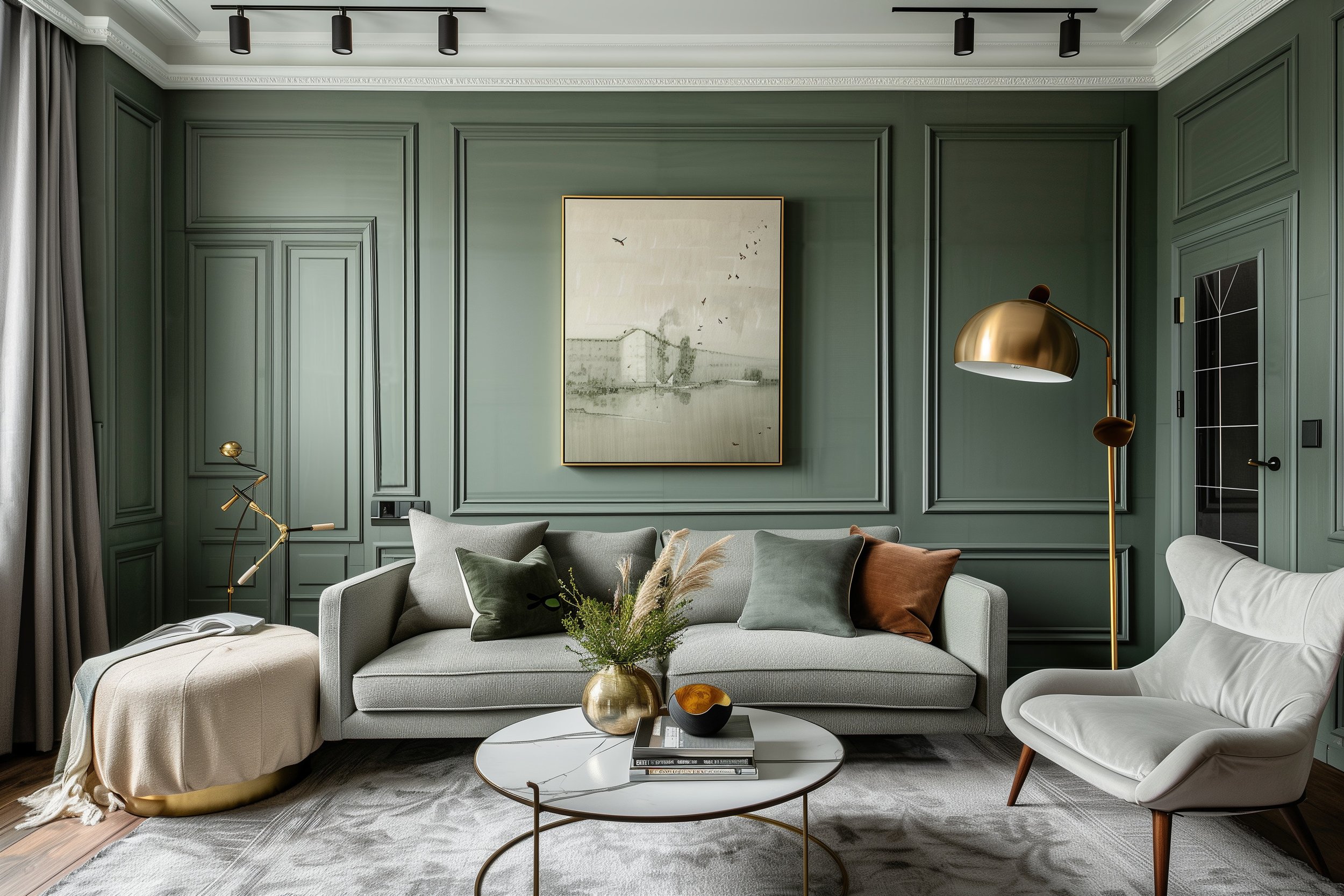
~Green can improve your mood when you’re feeling sad, hopeless, or depressed because of its association with nature. It’s considered the most balanced color, and it’s usually the first color patients trying color psychology experiment with. It encourages you to be independent and make changes, as well as enhances feelings of love, joy, and inner peace. Green is also said to stimulate wisdom, hope, strength, and serenity. Best in: Bedrooms, living rooms, kitchens, spas, and bathrooms.Worst in: Playrooms or gyms
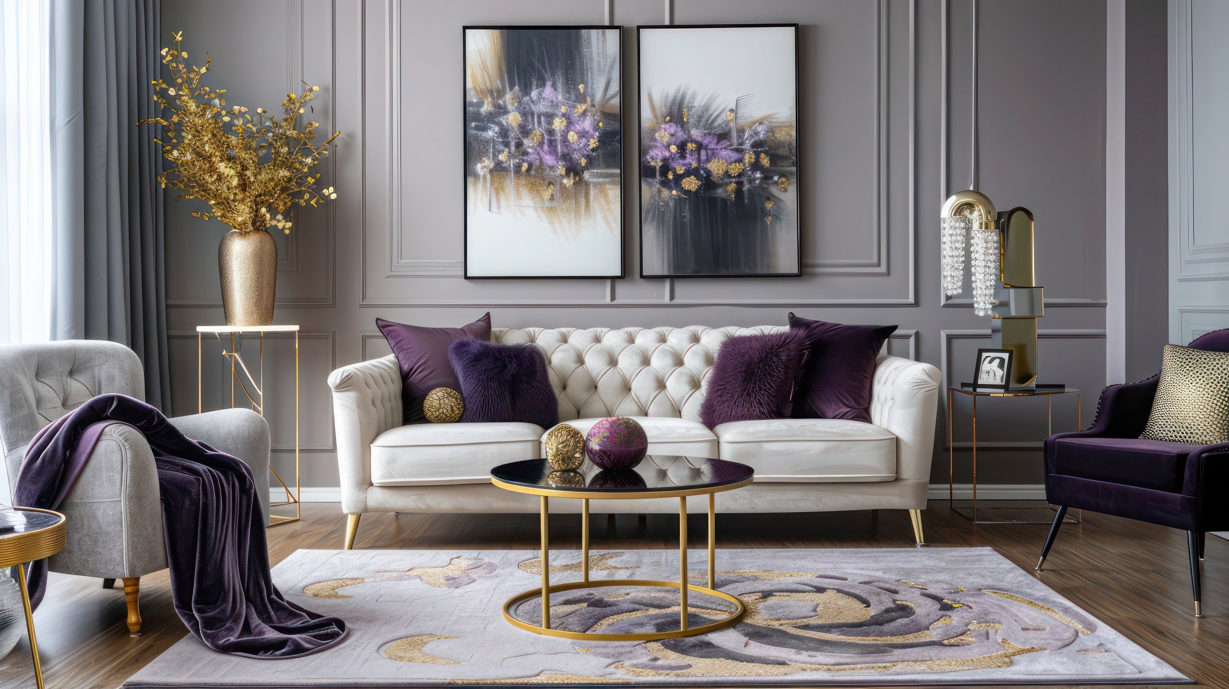
~Purple is similar to blue in the way it makes you feel calm and relaxed. Lighter shades, like lavender, tend to make you feel more hopeful or optimistic while dark, rich shades inspire feelings of power or strength. Best in: Bedrooms, offices, living rooms. Worst in: Playrooms or gyms, kitchens, dining rooms. Brown is a warm, grounding, neutral color that provokes a feeling of safety (probably since it’s a rich, earthy color). It doesn’t stand out much on its own, even though it can be used for entire walls or rooms.
~Brown reminds people of their basic necessities and important connections, like family and shelter. It blends well with most other colors. Best: In any room.
~Gray is the most neutral of neutrals and is associated with self-restraint or conformism at times, but also sleek sophistication and modern style. It has a calming, unemotional effect and can be somewhat draining on its own, but makes other colors stand out when used in combination. Darker shades of gray may make you feel edgier and moodier
(similar to navy blue or black) while lighter shades feel more timeless and hopeful. Best: In any room
~White is a light, neutral color associated with purity, innocence, and new beginnings. It has a decluttering effect and can make small spaces seem bigger, which can help stimulate your creativity and make you feel more refreshed and organized. However, too much white can feel sterile, harsh, or lonely. Best: In any room
~Black is commonly associated with evil, death, or the unknown, but in small doses, can look luxurious, elegant, and powerful. Black is also associated with positive traits like comfort. It is a bold color choice for a living space, though, so try using black in small amounts before committing to it as a wall color. Best: In any room
You don't necessarily need to invest in paint to change up the color scheme of your room. Wall art, pillows, blankets, rugs, and other decorative items all are great ways to incorporate color into a living space.
Remember that color theory isn't guaranteed to be effective before spending time and money repainting your home.
Metallic colors (like gold and silver) and accent pieces are stylish ways to promote excitement or creativity. Place metallic decor in any room where you need a bit more energy.
Wondering how to pick the perfect color for your space? Book a discovery call or leave a comment below with any questions!
Until next time,
Lynn


